


 Seonglae Cho
Nature only has frequencies, and colors are defined by the cells in human eyes and cognitive processes in the brain. Various frequency combinations can mimic the color of a specific frequency (red + green = yellow).
To connect the two ends of the spectrum, we have to introduce new hues, opposite to green: purples. They correspond to mixtures of red and blue-violet. These hues do not exist in the spectrum; they can only be obtained by mixing at least two wavelengths, one from each end.
At the dawn of the 20th century, Christine Ladd-Franklin proposed that colour vision appeared gradually over the course of evolution. The first eyes distinguishes only one dimension, between light and dark. A second dimension then appeared, allowing to differentiate long from short waves; yellow from blue. Finally, a third dimension differentiates from long from medium waves; red from green. Our distance ancestors also perceived a fourth dimension, in the ultraviolet, which many animals have retained to this day. But mammals would have lost two of these dimensions, force to hide under the reign of the dinosaurs. Even today, a tiger is still perfectly camouflaged in the eyes of tits prey. In humans and certain primates, the third dimension of colour has reappeared more recently.
Until now, we have organized according to physical criteria. They are useful mathematically, they do not reflect how we perceive colours from a sensory point of view. Different hues have different intensities for our eyes. Blue or yellow hues, for instance, seem more compressed than green one. Our perception is based on fundamental oppositions: between black and white, red and green, yellow and blue. A theory that is now considered as valid, because certain cells in the retina actually transform the red, green and blue signals into signals of oppositions.
Based on precise measurements of colour perception, some constructed detailed atlases, such as famous Munsell system (Albert Henry Munsell, 1898 / 1905). Yellow tends to appear lighter than others, such as blue. Some hues also tend to appear more vivid than others, such as magenta compared to turquoise.Within the spectrum, our eyes are more sensitive to medium wavelengths, which is why yellow appears brighter than indigo. Also, the intensity increases by a constant amount from one slice to the next. However, the variations seem stronger in the dark areas, than in the light areas. This is the Weber-Fechner law. We can model this effect with a mathematical function, , which represents our perception of brightness as a function of the actual physical luminance of the light.
Taking this effect into account, we can create a more perceptually uniform gradient. This is the founding principle of the “L.a.b” space (CIE, 1976). In 2020, Bjorn Ottossom proposed the “okLab” space as a more precise alternative. Its geometry resembles a deformed droplet.
Color Notion
Colors
The "Geometry" of Colours, from Newton to Schrödinger...
What are colours? Do they form a particular geometry? Can we build this geometry from our perceptions? All the answers in 20 minutes!
0:00 - Introduction
1:07 - What is a colour?
2:03 - Newton's disc
6:02 - The XYZ space
8:49 - Screens and vision
12:09 - Psychological approach
17:07 - Conclusion
Link to the game mentioned at 13:00: http://colors2.alessandroroussel.com/
_________________________________________________
This video is narrated by Octave Masson.
For more videos, subscribe to the YouTube channel : https://www.youtube.com/ScienceClicEN
And if you liked this video, you can share it on social networks !
To support me on Patreon : http://www.patreon.com/ScienceClic
or on Tipeee : http://tipeee.com/ScienceClic
Facebook page : http://facebook.com/ScienceClic
Instagram : http://instagram.com/ScienceClic
Alessandro Roussel,
For more info: http://www.alessandroroussel.com/en
_________________________________________________
ScienceClic Français : http://youtube.com/ScienceClic
ScienceClic Español : http://youtube.com/ScienceClicES
_________________________________________________
Sources and bibliography:
https://www.researchgate.net/publication/367216474_Helmholtz_and_the_geometry_of_color_space_gestation_and_development_of_Helmholtz's_line_element
https://www.researchgate.net/publication/377372066_Helmholtz_Schrodinger_and_the_First_Non-Euclidean_Model_of_Perceptual_Color_Space
https://link.springer.com/content/pdf/10.1007/s00407-023-00317-x.pdf
https://www.gutenberg.org/files/33504/33504-h/33504-h.htm
http://www.gutenberg-e.org/lowengard/A_Chap03.html
https://royalsocietypublishing.org/doi/epdf/10.1098/rstl.1802.0004
https://pubmed.ncbi.nlm.nih.gov/17026602/
https://www.eizo.com.cn/global/library/EIZO_DCH_APPENDIXA.pdf
https://www.jcgt.org/published/0014/01/01/paper.pdf
http://www.color-theory-phenomena.nl/08.00.html
https://rmit.pressbooks.pub/colourtheory1/chapter/modern-era-c-1850-to-1980/
https://pteromys.melonisland.net/munsell/
https://www.webexhibits.org/colorart/ganglion.html
https://www.icst.pku.edu.cn/mipl/docs/F8A22B42-BDB9-137E-C51F5F9B422FE985_49512.pdf
https://www.pnas.org/doi/full/10.1073/pnas.2119753119
https://www.science.org/doi/10.1126/sciadv.adu1052

https://youtu.be/7KYwi2F5Ce4?si=hDXJwrHP8dGl1hGn

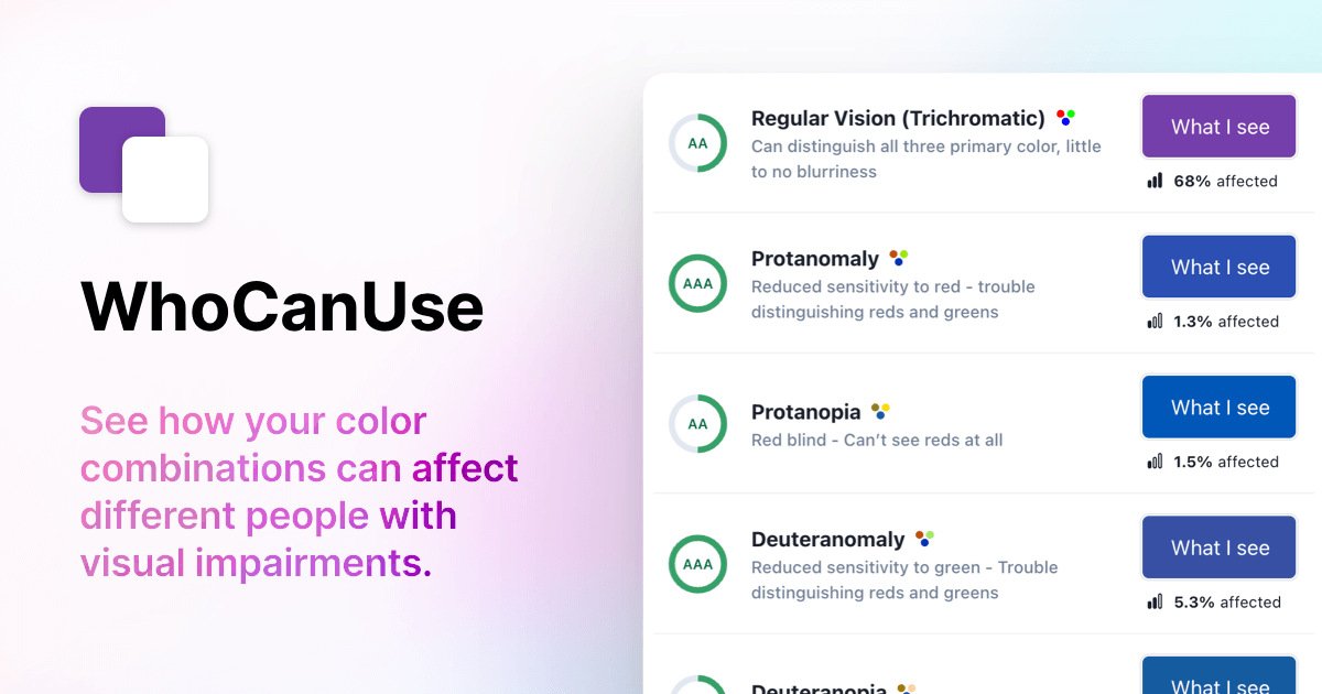
WhoCanUse
A tool that brings attention and understanding to how color contrast can affect people with different visual impairments.

https://www.whocanuse.com/
Subtractive and Additive Color Models
잉크젯 프린터 |이 뒤에 있는 흥미로운 엔지니어링
잉크젯 프린터는 정말로 C Y와 M 컬러의 마법입니다. 이 동영상에서는 이러한 시스템이 어떻게 논리적으로 작동하는지 알아보겠습니다.

https://youtu.be/lNfq7NEhnpA

UI를 위한 색
우리의 눈이 보는 색의 원리와 UI 디자인 | 색은 강한 자극을 주는 시각 언어입니다. 화면 내에서 사용자를 행동하게 하거나 반드시 알아야 하는 정보를 강조하기 위해 주로 사용하는 요소입니다. UI를 디자인하면서 시각 원리가 어떻게 적용되는지 예시를 들어 정리했습니다. 색 속성 색은 3가지 속성이 있습니다.
https://brunch.co.kr/@blckschrl/41
